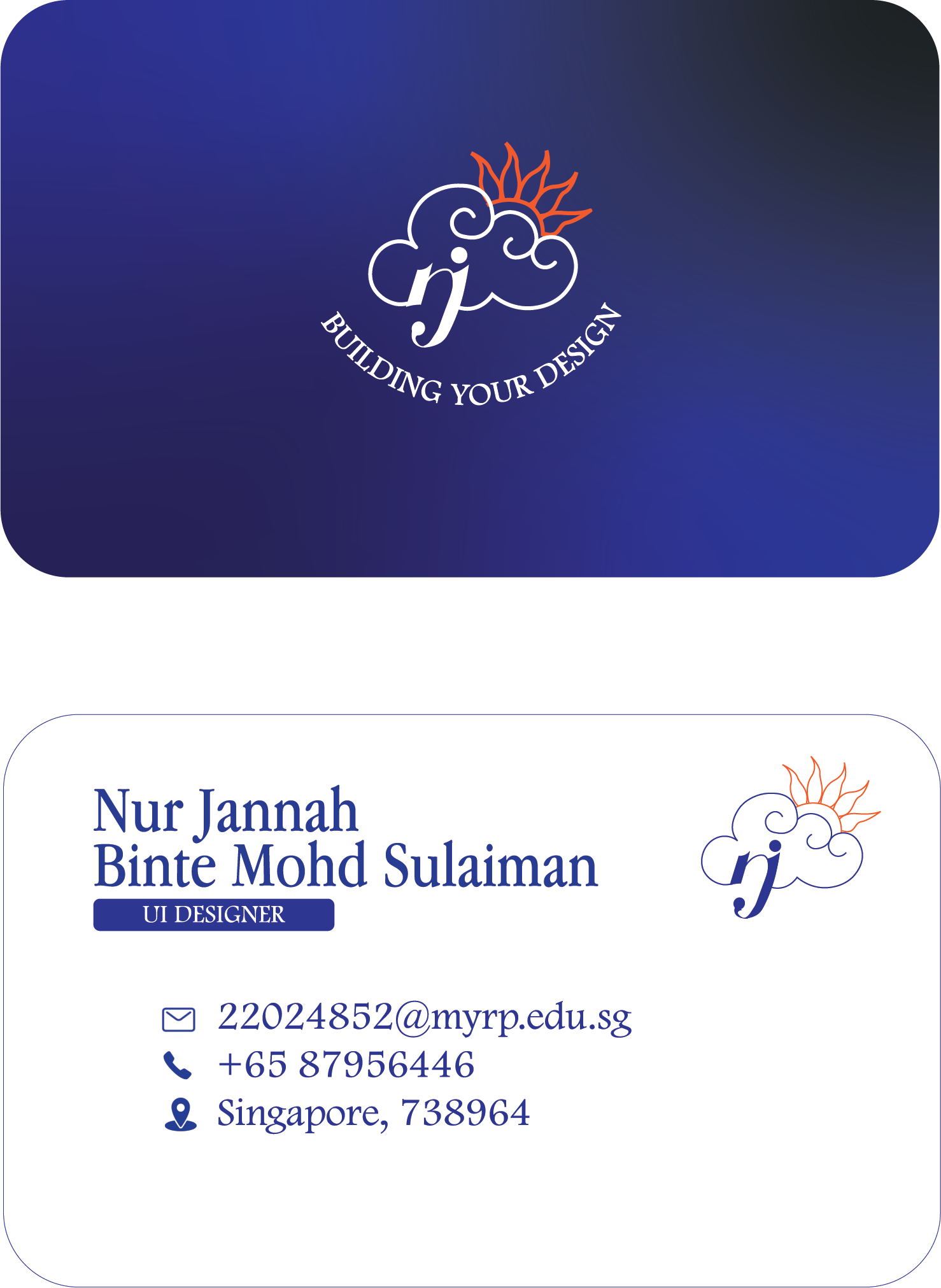
Name Card Design
The name card is supposed to be able to present me to potential clients and companies. So I planned on something that looks professional. I want to present the best of myself. I chose a colour palette that would remind people of the sky due to my logo. The curved corners provide a sense of smoothness towards the design and make it look as professional as possible. The curved tagline also provides my logo with a shape so I can put it exactly in the middle and avoid sharp angles that may make my design less smooth. The front design is clear and straightforward. I chose fonts that are similar to each other, both are serif fonts. Both of the fonts are seen in the poster and the website. It will create a cohesiveness in the brand image through using the same fonts. The back design shows icons of different information the person who recives them will need. It is then accompanied by the information. I chose a simple design for my name card as it will reflect to the person that I am neat with my work.