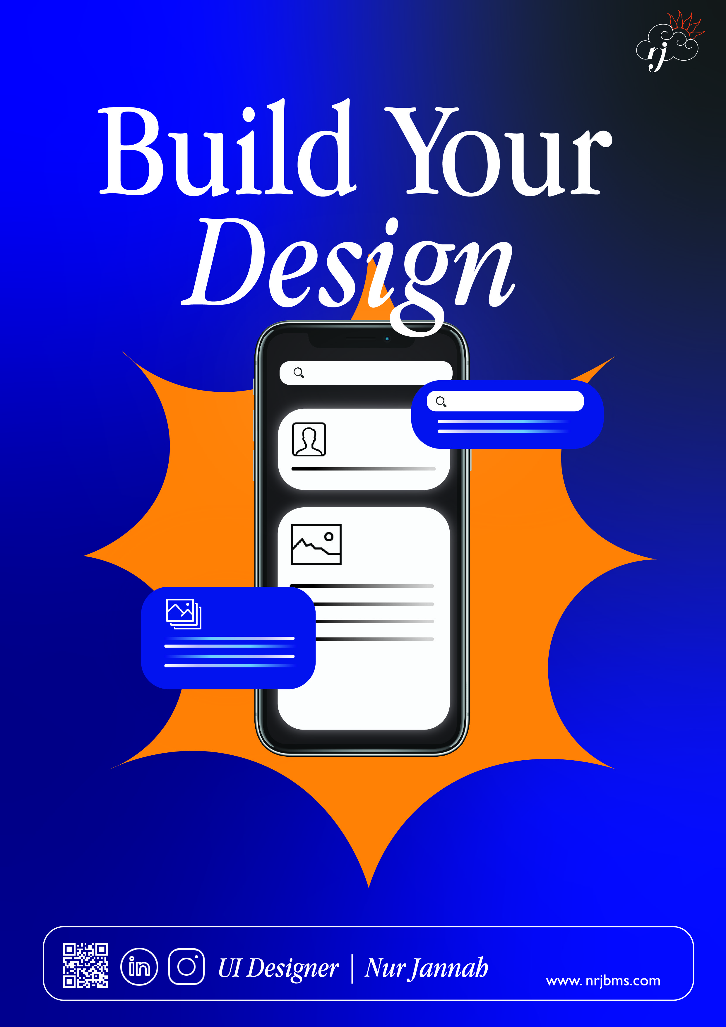
Personal Poster
The purpose of the poster is for potential clients to reach out to the company and see what they offer for UI design. The colours in the poster are complementary to emphasise the displayed mobile user interface. The orange pop-coloured icon will draw the attention of the viewer to the main image of a user design. It is made up of sharp line and is the only bright shape in the whole design, and will capture the attention of the viewer first. The tagline "Build your design" will make viewers feel included in creating a user interface with the company. The font chosen is a serif font to keep the poster in line with the name card and website. The Apple Garamond font is a serif font with a height that looks good and fits well with the brand's image and design. The tagline in the picture is also slightly covered in the design to show depth and encourage people to look closer into the poster. The gradient background is also used in the name card, to create a cohesive brand image. The background and the curve design of the phone and the icons of the mobile interface create a clean design that is smooth and pleasing to look at.